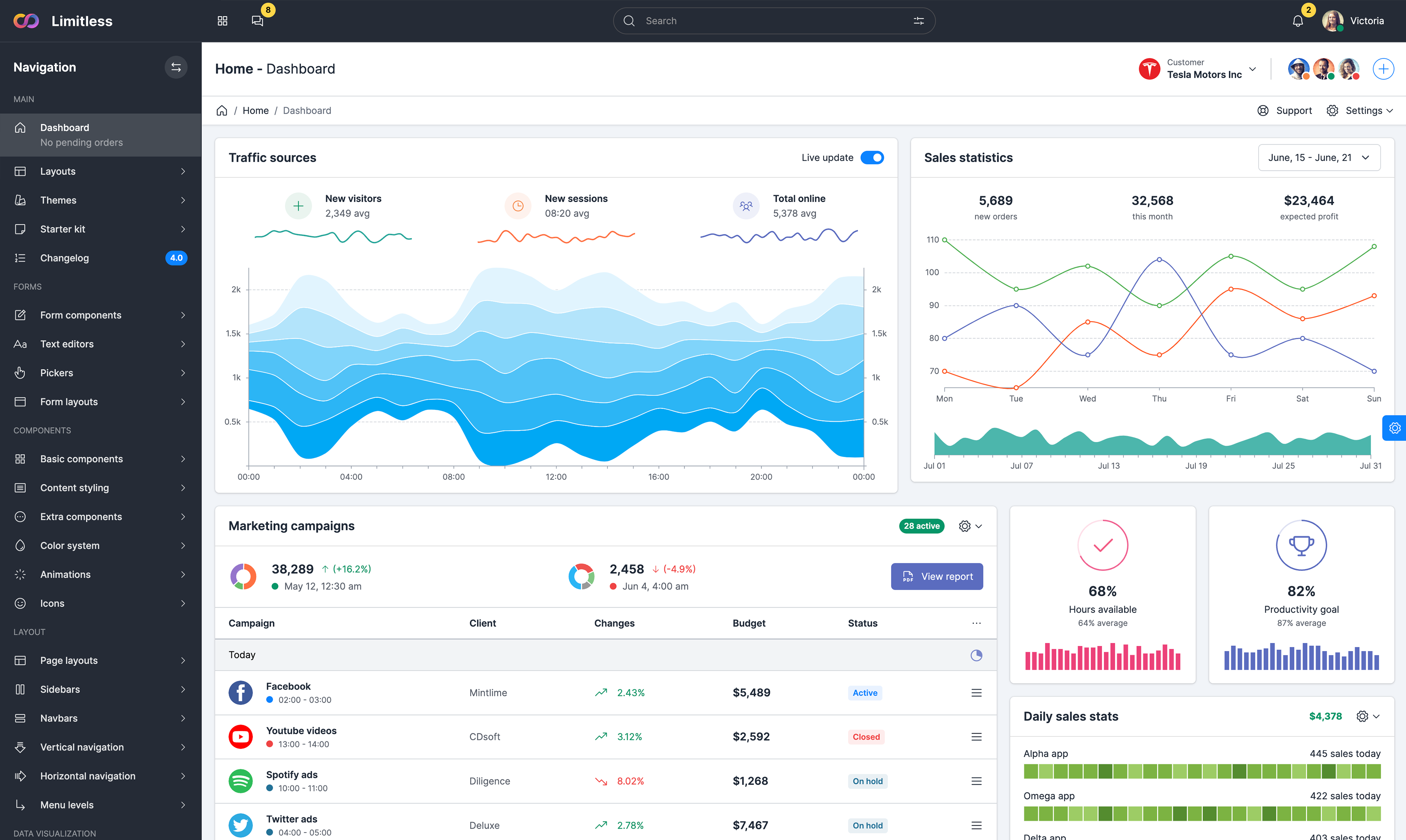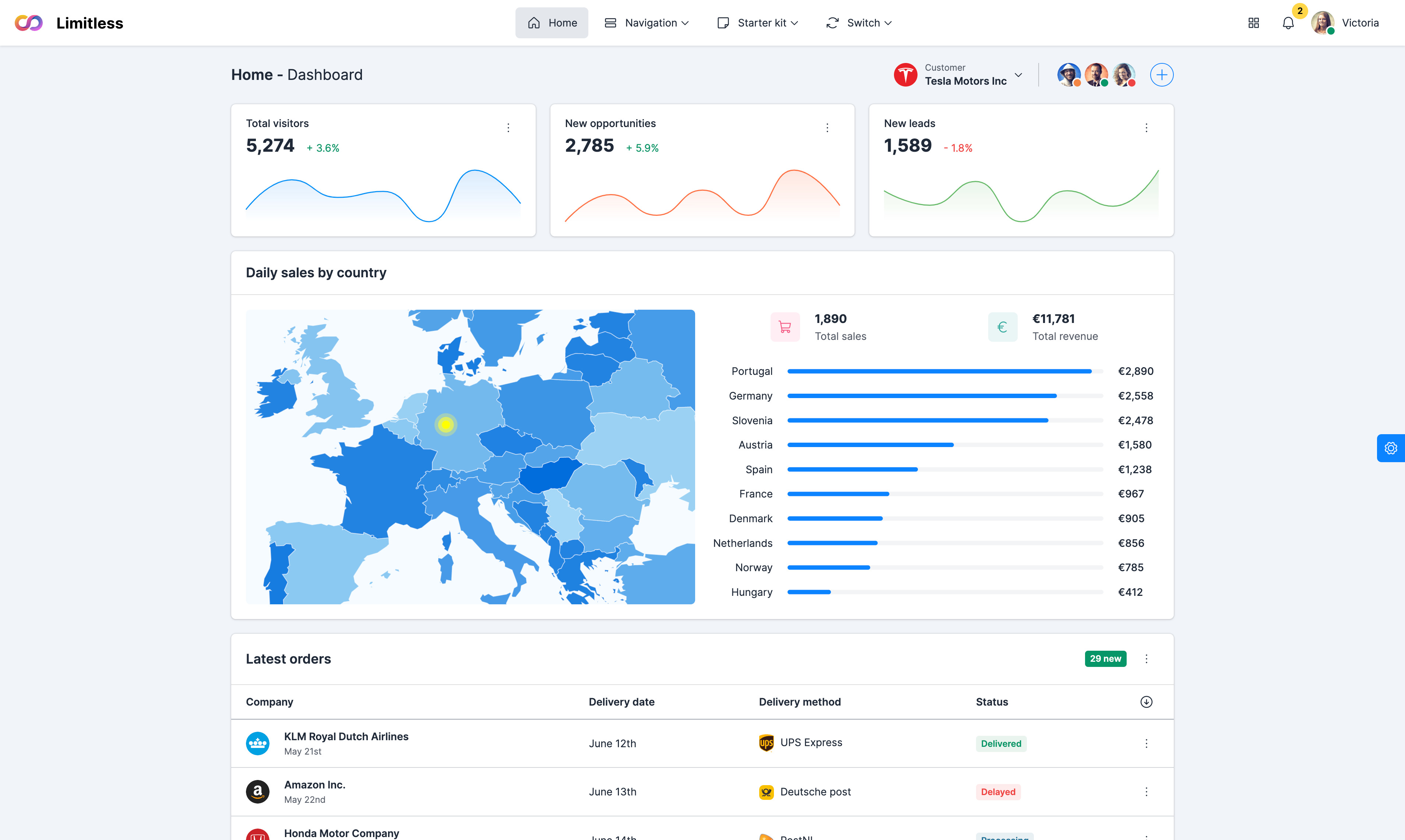


Geo chart
A geochart is a map of a country, a continent, or
a region with areas identified in one of three ways:
region mode,
markers mode and
text mode. A geochart is
rendered within the browser using SVG or
VML. Note that the geochart is not scrollable or
draggable, and it's a line drawing rather than a terrain map.
The regions style fills entire regions (typically
countries) with colors corresponding to the values that you
assign.
Trendlines
A trendline is a line superimposed on a chart
revealing the overall direction of the data. Google Charts can
automatically generate trendlines for Scatter Charts, Bar
Charts, Column Charts, and Line Charts. Here, we display a
generated trendline for Bar chart for each of two series,
setting the labels in the legend to "Bug line" (for series 0)
and "Test line" (series 1).
Candlestick chart
A candlestick chart is used to show an opening
and closing value overlaid on top of a total variance.
Candlestick charts are often used to show stock value
behavior. In this chart, items where the opening value is less
than the closing value (a gain) are drawn as filled boxes, and
items where the opening value is more than the closing value
(a loss) are drawn as hollow boxes.
Diff chart
A diff chart is a chart designed to highlight the
differences between two charts with comparable data. By making
the changes between analogous values prominent, they can
reveal variations between datasets. You create a diff chart by
calling the computeDiff method with two datasets to generate a
third dataset representing the diff, and then drawing that.
Sankey diagrams
A sankey diagram is a visualization used to
depict a flow from one set of values to another. The things
being connected are called
nodes and the connections are
called links. Sankeys are
best used when you want to show a many-to-many mapping between
two domains (e.g., universities and majors) or multiple paths
through a set of stages.