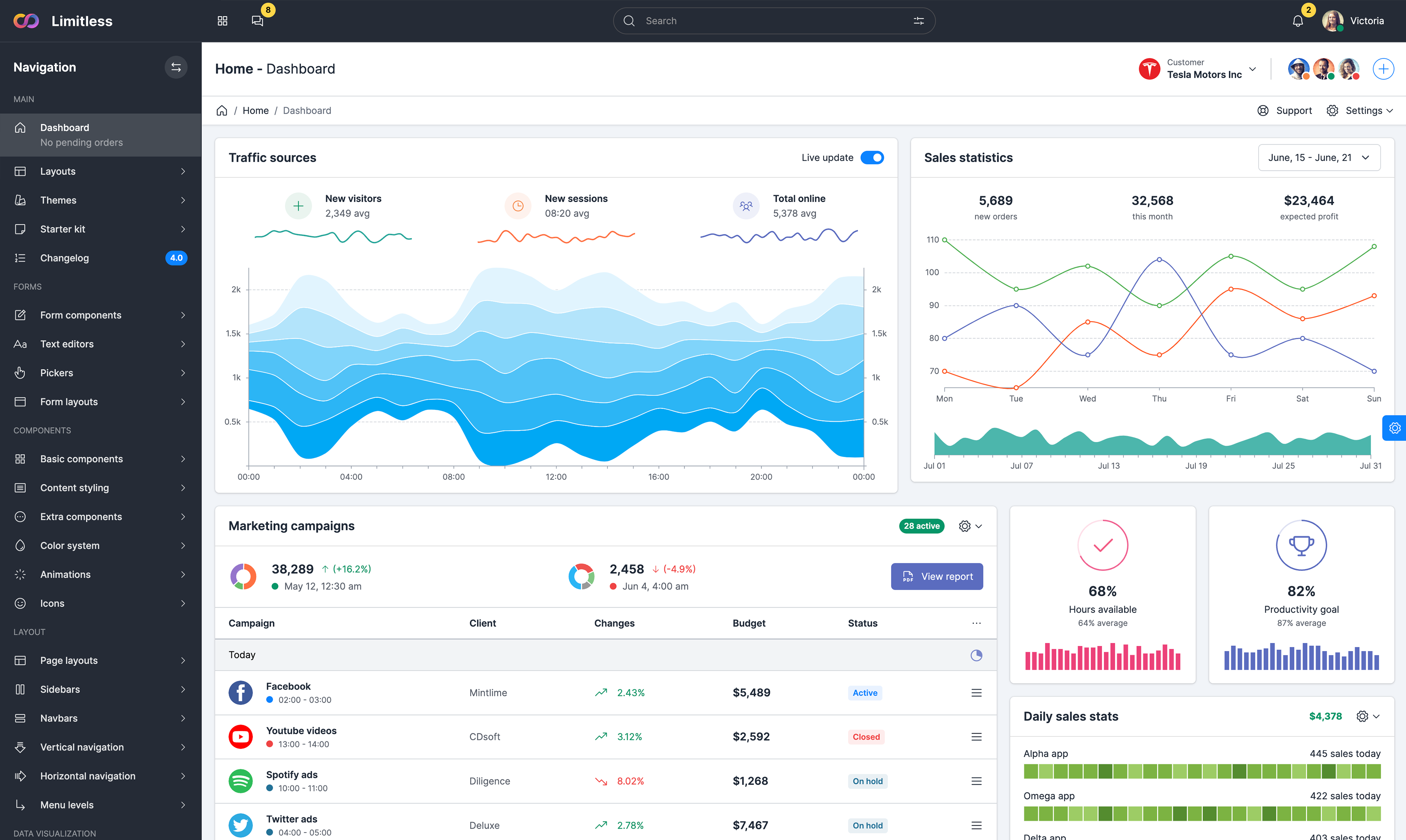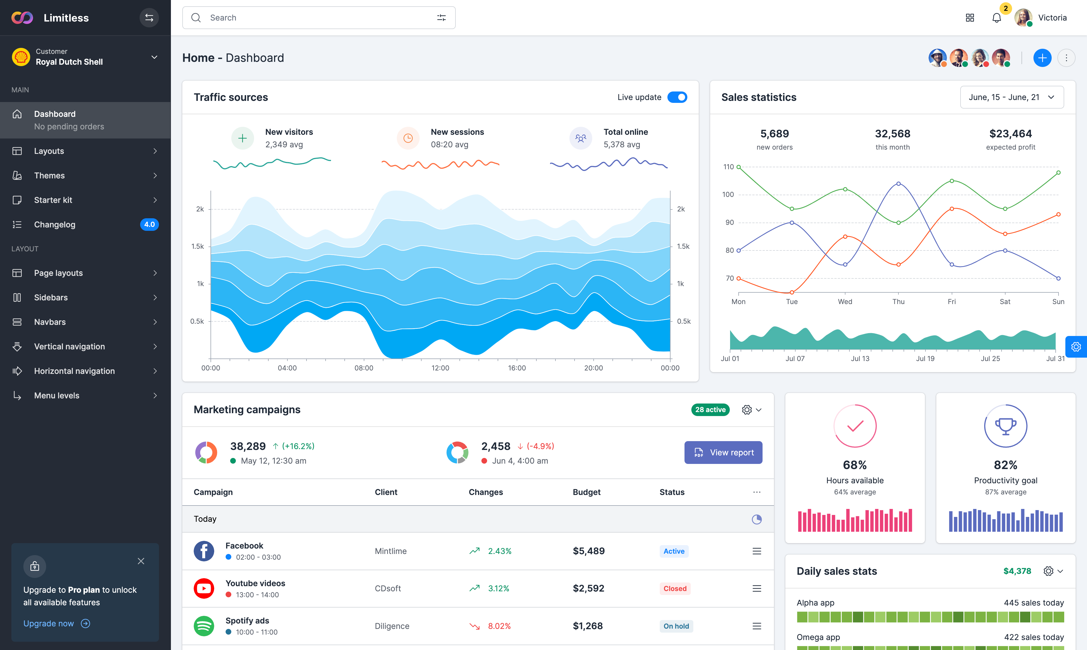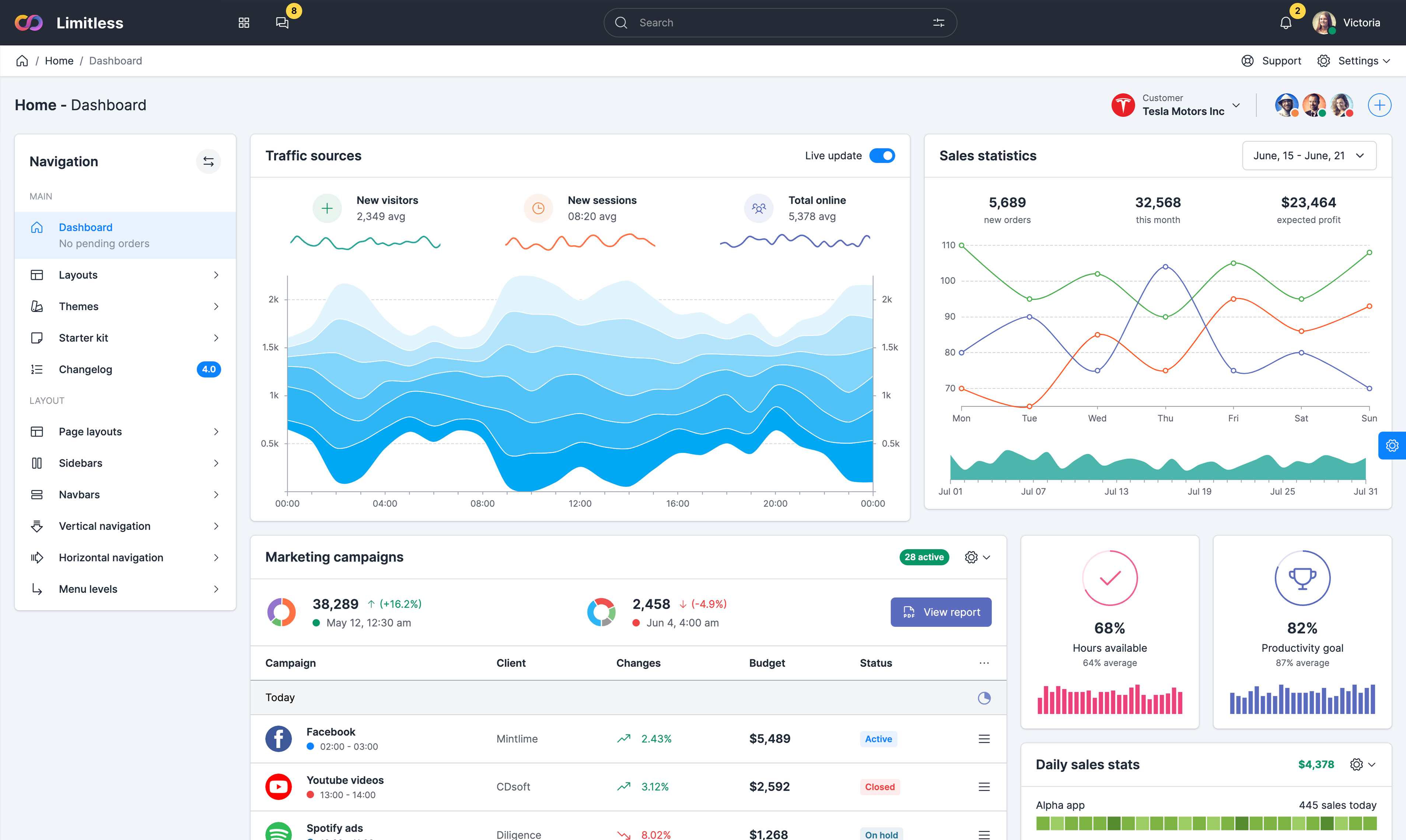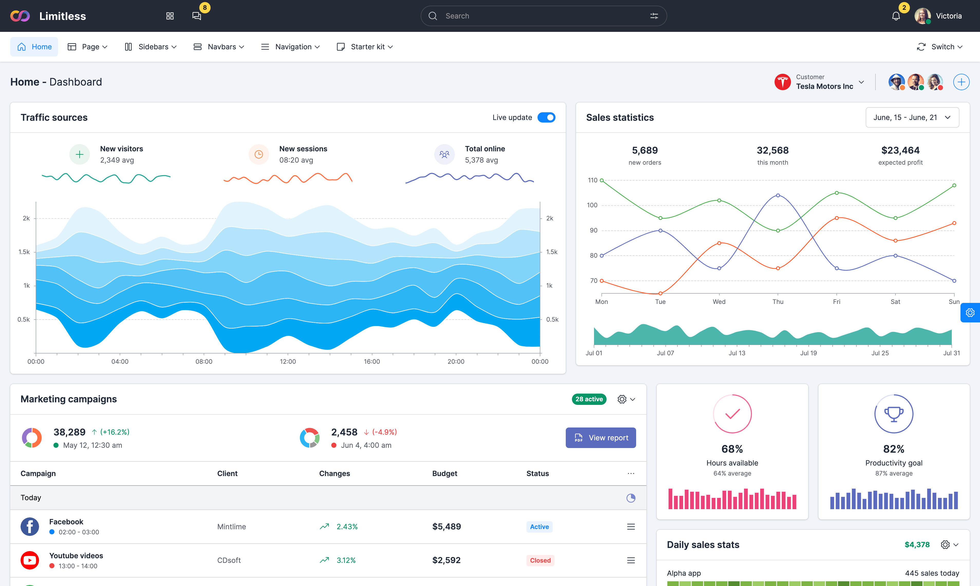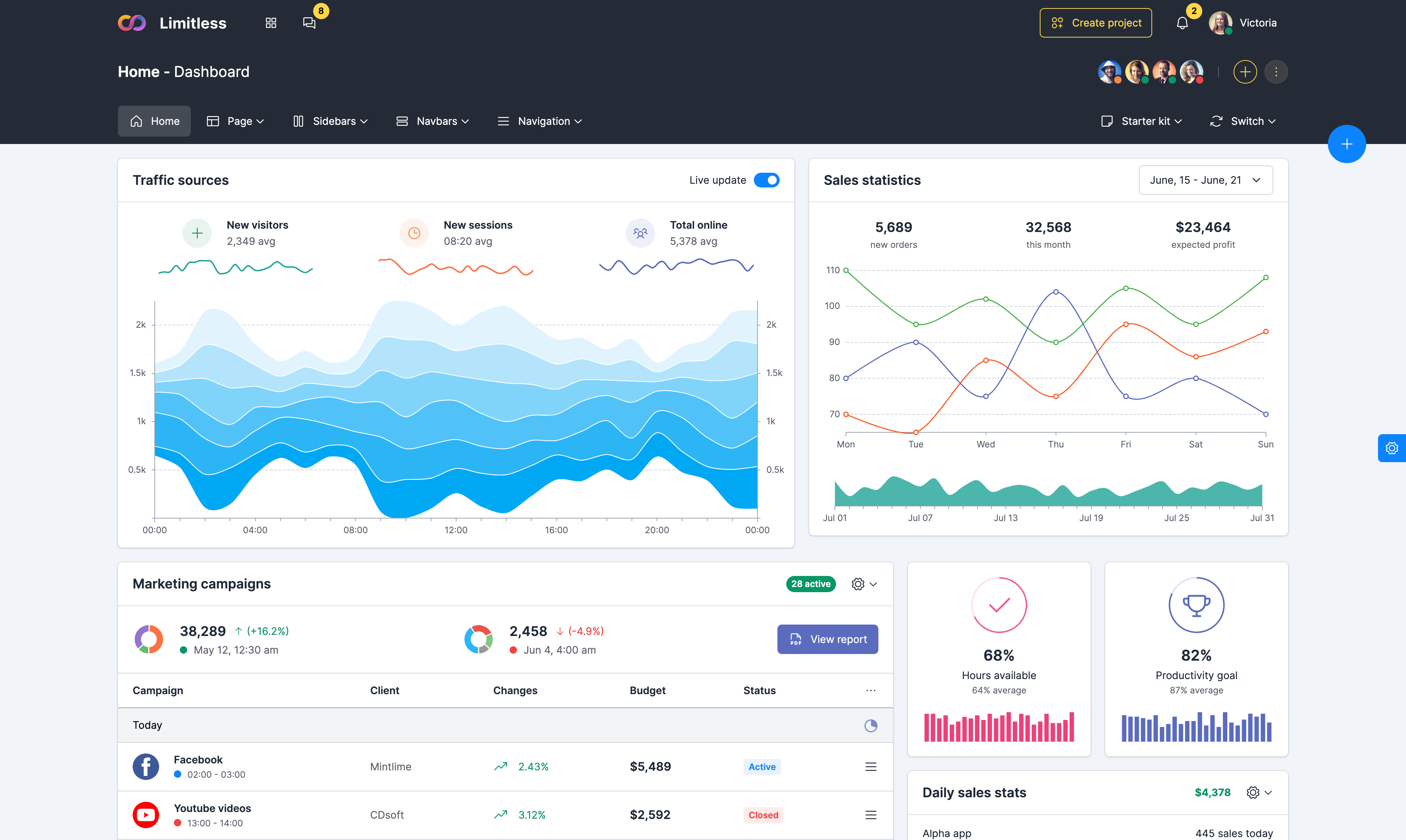


Streamgraph chart
Example of streamgraph chart with data tooltip.
Streamgraphs are a generalization of stacked area graphs where
the baseline is free. By shifting the baseline, it is possible
to minimize the change in slope (or “wiggle”) in individual
series, thereby making it easier to perceive the thickness of
any given layer across the data. Hover on area to see the
tooltip with data on the top left corner.
Waterfall chart
Basic example of waterfall chart. The waterfall
chart is normally used for understanding how an initial value
is affected by a series of intermediate positive or negative
values. Usually the initial and the final values are
represented by whole columns, while the intermediate values
are denoted by floating columns. The columns are color-coded
for distinguishing between positive and negative values. Axis
labels rotated just for fun.
Bubble chart
Example of bubble chart layout. Bubble charts
encode data in the area of circles. This type of chart can
facilitate the understanding of social, economical, medical,
and other scientific relationships. Although less
perceptually-accurate than bar charts, they can pack hundreds
of values into a small space. Data tooltip is displayed on
circle hover.
Zoomable treemap
Treemaps display hierarchical (tree-structured) data as a set of nested rectangles. Each branch of the tree is given a rectangle, which is then tiled with smaller rectangles representing sub-branches. A leaf node's rectangle has an area proportional to a specified dimension on the data. Often the leaf nodes are colored to show a separate dimension of the data.