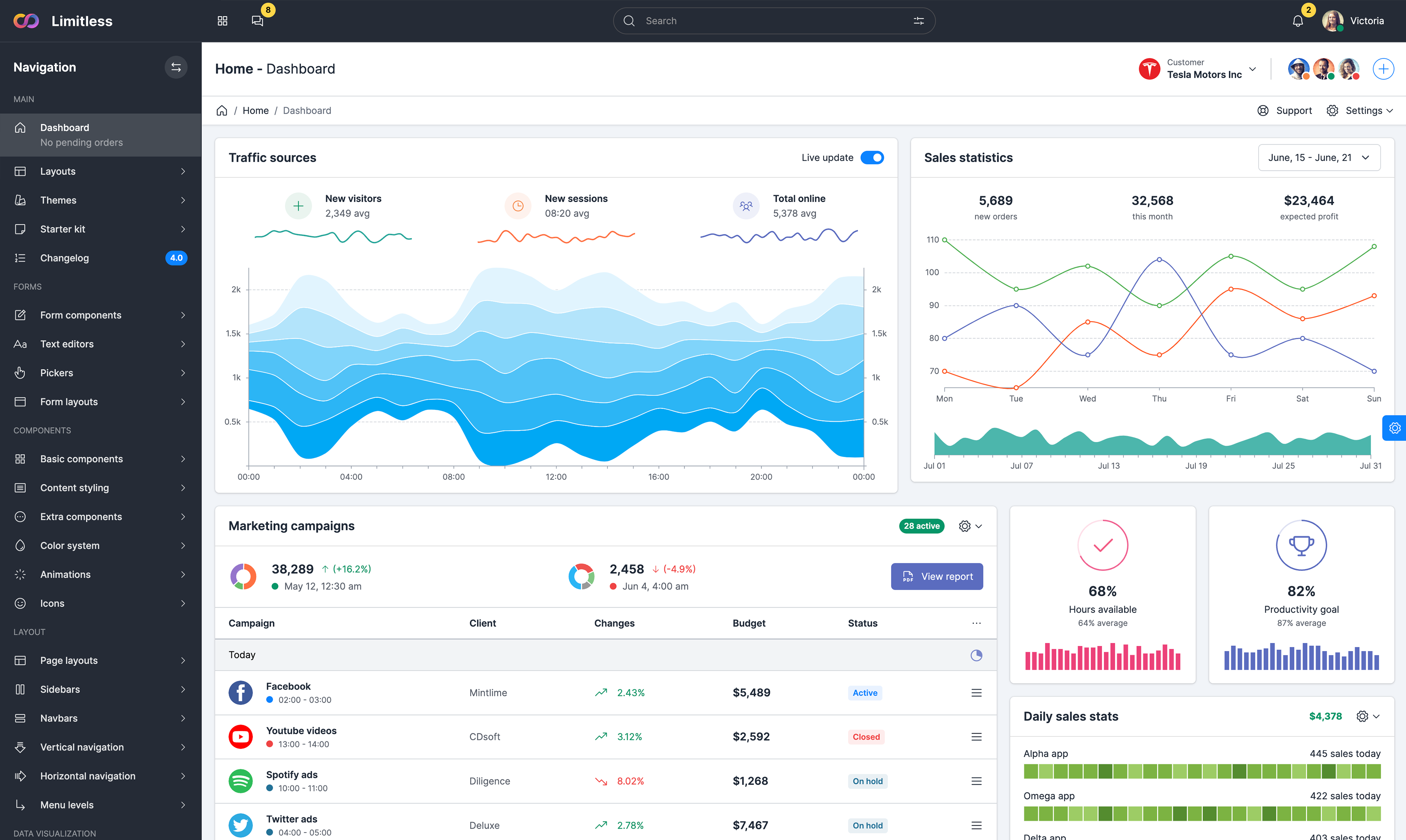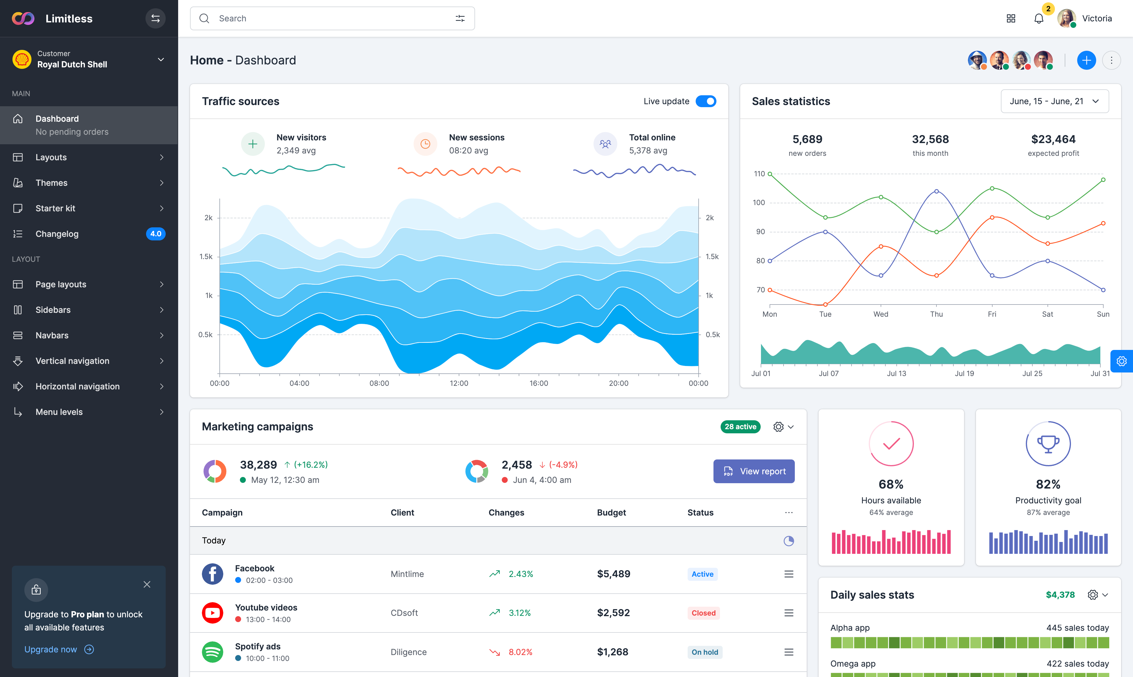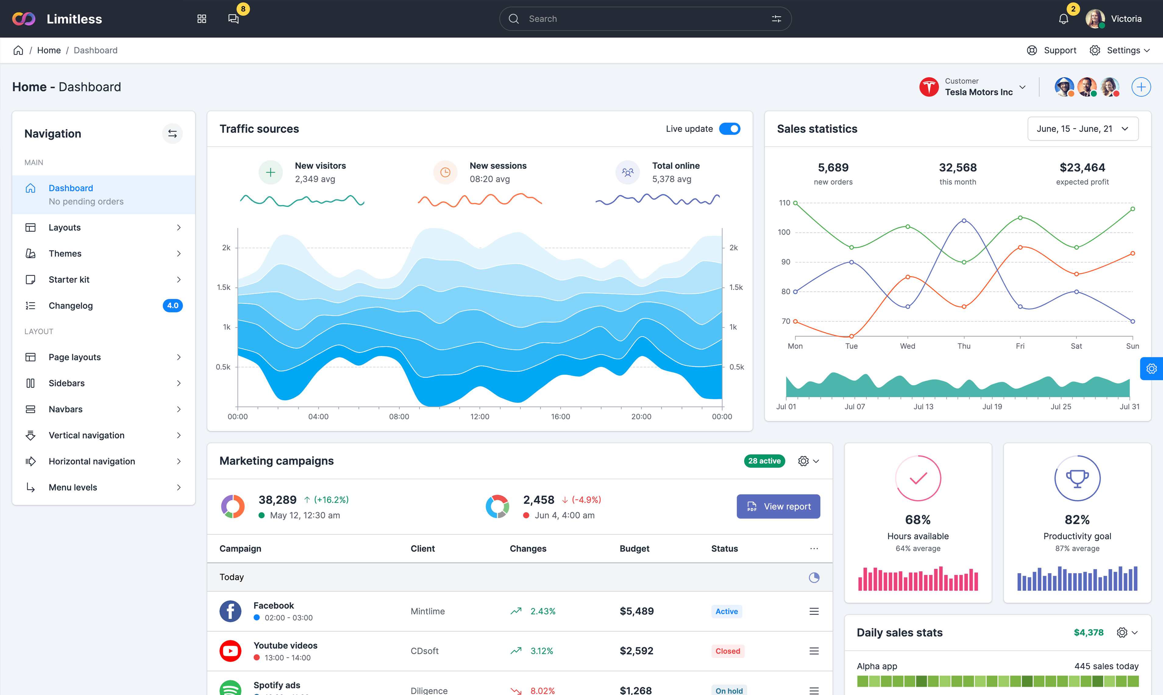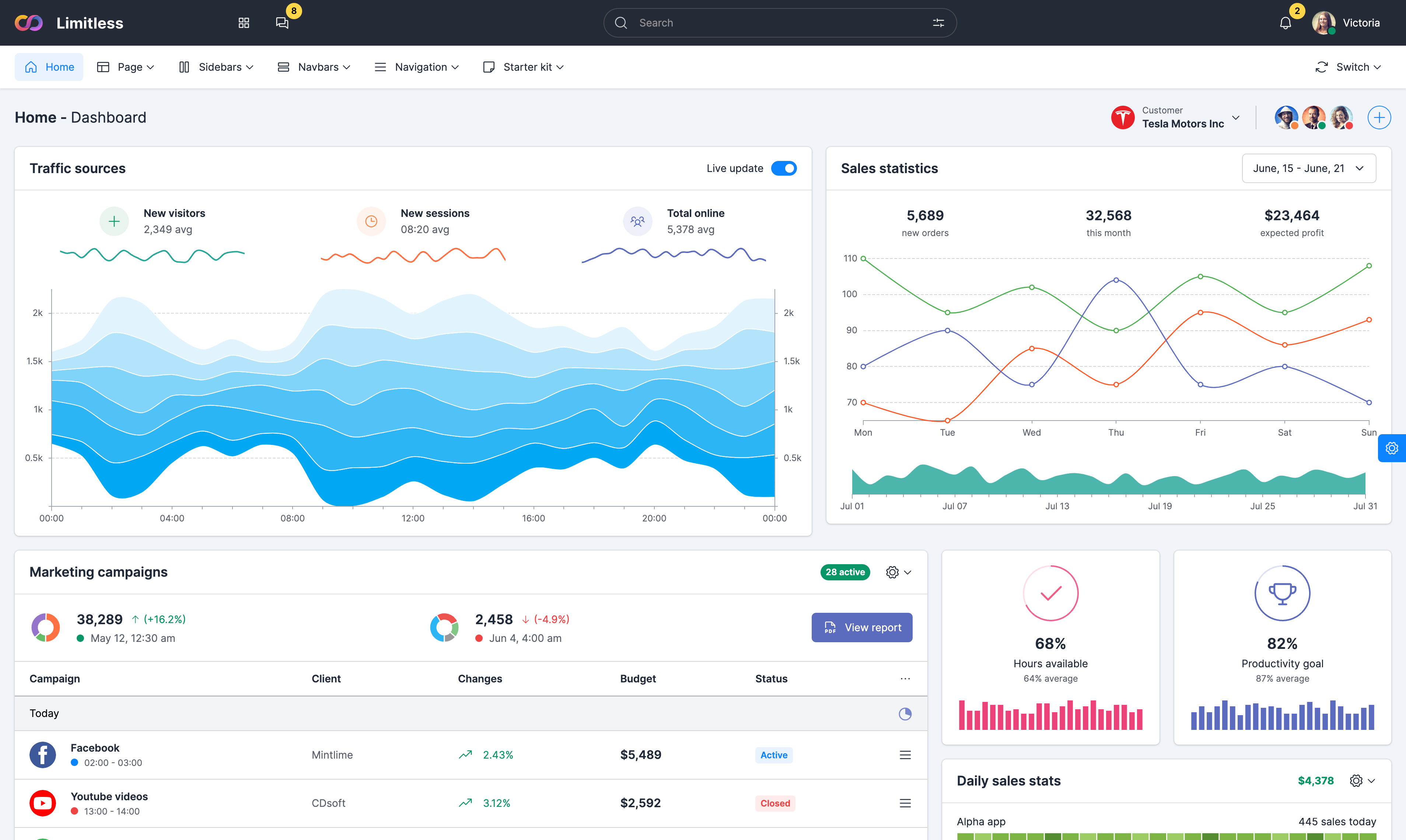


Column chart
A column graph is a chart that uses vertical bars
to show comparisons among categories. One axis of the chart
shows the specific categories being compared, and the other
axis represents a discrete value. Like all Google charts,
column charts display tooltips when the user hovers over the
data. By default, text labels are hidden, but can be turned on
in chart settings.
Stacked column chart
Stacked column charts present the information in
the same sequence on each bar. The stacked bar chart stacks
bars that represent different groups on top of each other. The
height of the resulting bar shows the combined result of the
groups. However, stacked bar charts are not suited to datasets
where some groups have negative values. In such cases, grouped
bar charts are preferable.
Bar chart
A bar graph is a chart that uses horizontal bars
to show comparisons among categories. One axis of the chart
shows the specific categories being compared, and the other
axis represents a discrete value. Like all Google charts,
column charts display tooltips when the user hovers over the
data. By default, text labels are hidden, but can be turned on
in chart settings.
Stacked bar chart
Stacked column charts present the information in
the same sequence on each bar. The stacked bar chart stacks
bars that represent different groups on top of each other. The
height of the resulting bar shows the combined result of the
groups. However, stacked bar charts are not suited to datasets
where some groups have negative values. In such cases, grouped
bar charts are preferable.
Simple histogram
A histogram is a chart that groups numeric data
into bins, displaying the bins as segmented columns. They're
used to depict the distribution of a dataset: how often values
fall into ranges. Google Charts automatically chooses the
number of bins for you. All bins are equal width and have a
height proportional to the number of data points in the bin.
In other respects, histograms are similar to column charts.
Combo chart
Example of combo chart based on Google
Visualization library. A chart that lets you render each
series as a different marker type from the following list:
line, area, bars, candlesticks, and stepped area. To assign a
default marker type for series, specify the seriesType
property. Use the series property to specify properties of
each series individually.